Meaning at a glance
Use a flexible framework—based on wardrobe coordination, contrast preference, lighting, metal choice, maintenance needs, and personal meaning—rather than fixed skin‑tone rules.
Quick answer
How to choose jewelry colors: use a non‑prescriptive framework that prioritizes your wardrobe and other practical factors—contrast preference, typical lighting, metal choice, and maintenance—plus the personal or cultural meanings you care about, instead of relying on rigid skin‑tone rules.
Why a flexible, non‑prescriptive approach works best
Many guides present color selection as if a single rule fits everyone. In practice, jewelry lives with clothing, lighting, and daily habits, and it carries personal and sometimes cultural meaning. A flexible framework treats color as one decision among several: how a piece sits against your clothes, how it behaves under the lights you spend time in, whether the metal elevates the gem color, and how much upkeep you are willing to do.
Documented historical evidence and what it can (and can’t) tell us
Gemological and trade scholarship documents how certain gemstones and colors entered markets, were valued, and were transported. The Gemological Institute of America (GIA) maintains research on colored stones that covers identification, origin, and how stones have been treated and traded; this kind of work is the basis for understanding why particular gems were prized in different places and times rather than providing a single symbolic meaning that applies everywhere.
When writing about 'historical meanings,' be specific about the source, period, and culture. For example, gem trade histories or museum records can show which gemstones were rare or imported in particular eras; such documentation explains historical rarity and prestige but does not automatically mean everyone in that place held the same symbolic belief. Modern interpretation often layers new meanings over older practices.
Separating documented historical meanings from modern personal interpretations
Documented historical meanings are those supported by evidence such as trade records, inscriptions, ceremonial use, or contemporary accounts preserved and interpreted by historians and institutions. GIA’s research helps with documented facts about gem origins, treatments, and the roles stones played in commerce and collecting, which is useful for tracing how a color or gem became valued.
Modern personal interpretations are individual or community uses of color and symbol today—an amethyst chosen for calm, a green stone chosen for environmental affinity, or family associations with a particular hue. These personal meanings are valid for the wearer but are not the same as a documented cultural symbolism unless supported by historical sources.
How motifs, gemstones, and traditions appear in jewelry
Motifs—floral, geometric, religious, or cultural icons—appear as metalwork, engraving, enamel, or stone settings. The visual impact of a motif depends on its scale, contrast with the metal, and whether it relies on color (such as cloisonné enamel) or texture.
Gemstones bring color through hue, tone, and saturation. According to GIA’s guidance on colored gemstone value factors, hue (the basic color), tone (light to dark), and saturation (intensity) determine how a gem’s color reads in different settings. Designers select cuts, settings, and metal to either emphasize or soften those attributes.
Traditions appear when specific colors or gems are repeatedly used in cultural or ceremonial contexts. Documentation of these traditions may appear in museum collections, trade histories, or the research recorded by institutions like GIA; where documented, they help explain why a color choice might carry particular meaning for people from that tradition.
Practical factors to include in your decision framework
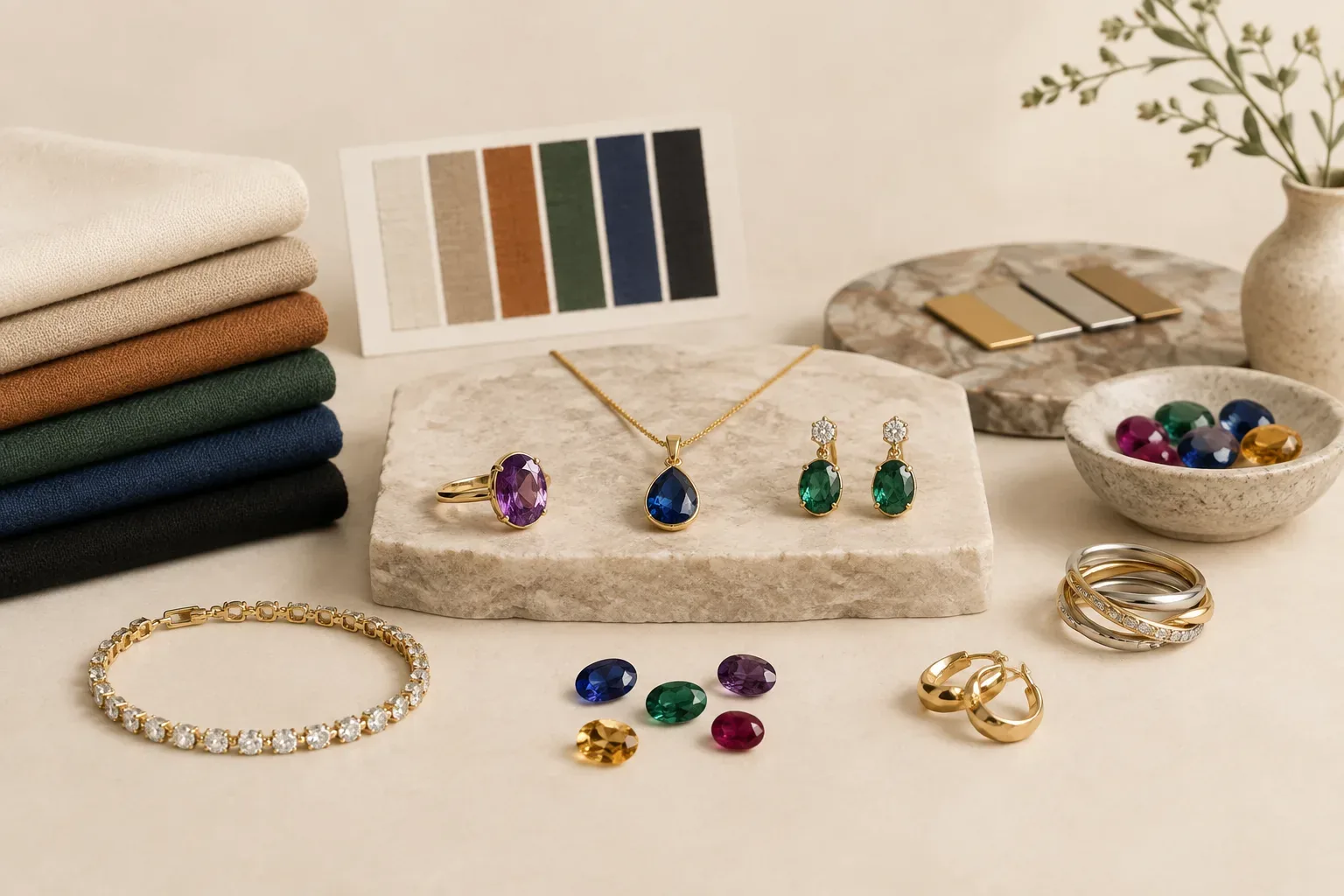
Wardrobe: Start by looking at the colors you wear most. Jewelry that harmonizes or provides a deliberate contrast with your everyday palette will be worn more often than a piece that only 'matches' one outfit. Think about whether you prefer your jewelry to blend with neutrals or to pop as an accent color against dominant clothes.
Contrast preference: Decide whether you want harmony or contrast. A warm gold setting with a warm‑toned gem creates harmony; a cool silver setting with a warm gem increases contrast. This is a stylistic choice, not a rule about skin tone.
Lighting: Light changes how color reads. GIA’s gem photography guidance explains that color temperature, diffusion, and intensity affect appearance. Consider the lighting where you spend time—warm indoor light can deepen warm tones; daylight can reveal the true hue and saturation of a stone.
Metal choice: Metals influence perceived color. Yellow gold tends to warm surrounding hues, white metals (platinum, white gold, silver) make colors appear cooler or cleaner, and rose gold adds warm pinkish reflections. Metal finish—polished, matte, or brushed—also affects visual weight and contrast.
Maintenance and durability: Some colorful materials are delicate. GIA’s materials on stone treatments and identification highlight that durability and treatments affect long‑term appearance and care needs. If you want low maintenance, choose harder gemstones or colors produced in durable settings; be sure to ask about treatments and care requirements when buying.
Personal meaning and cultural sensitivity: Consider whether a color or motif has importance to you or to the recipient. If a motif or color is part of another culture’s religious or ceremonial tradition, research or ask respectfully rather than assume a universal meaning. For gems, the Federal Trade Commission (FTC) recommends clear disclosure about treatments, lab‑grown versus natural status, and imitations—information that can also influence whether a piece feels meaningful or authentic to you.
Selection and gifting guidance that is practical and respectful
If you’re selecting for yourself, use a small test: try a piece against a go‑to outfit in the light you wear most. Photograph it in that light—GIA notes that photography and lighting influence how gems look—and wear it for a day to see if the color feels right across activities.
When gifting, ask about metal allergies, lifestyle, and whether the recipient prefers subtle or statement pieces. If you want the gift to carry a particular meaning, either choose a documented symbol from the recipient’s tradition with care and consultation, or select a personal explanation to share, making your intent clear.
For potentially culturally sensitive motifs or colors, do a little research first. If you cannot confirm the cultural context, err on the side of asking or choosing a neutral symbol. Respectful gifting means avoiding appropriation of sacred symbols and being honest about the piece’s origin and any treatments—per FTC guidance on disclosure.
Putting the framework into action: three simple workflows
Everyday wearable: Choose a metal that matches your existing jewelry stack, pick a gem with good durability, and select a hue that either harmonizes with the most common colors in your wardrobe or provides a deliberate accent. Confirm treatments and care instructions before you buy.
Statement piece: Identify a single outfit or color you want to accent. Use contrast intentionally—choose a gem whose saturation will stand out in your typical lighting. Opt for a setting that showcases the motif or color and choose a metal that increases the intended visual effect.
Gift with meaning: Start by asking subtle, neutral questions about color or metal preference. If you want to connect to family or cultural tradition, verify the documented meaning through reliable sources or family members. Be transparent about whether a gemstone is natural, treated, lab‑grown, or an imitation, as recommended by the FTC.
Final thoughts
Choosing jewelry colors is a practical design decision and a personal one. Use a flexible framework that respects documented histories where relevant, prioritizes wardrobe and lifestyle, accounts for lighting and metal, and centers personal meaning and transparent information about gemstones. That approach is more useful and respectful than relying on simplistic, one‑size‑fits‑all rules.
Frequently asked questions
Should I choose jewelry colors based on my skin tone?
Instead of strict skin‑tone rules, use a flexible approach: consider your wardrobe, whether you want contrast or harmony, the lighting you are usually in, and which metals you already wear. These practical factors often matter more for everyday wear.
How does lighting affect how a gemstone's color looks?
Lighting changes how hue, tone, and saturation appear. Daylight typically shows a gem’s truer color, while warm indoor light can deepen warm tones. The Gemological Institute of America advises considering lighting and using photography to preview how a gem will look in typical conditions.
Are treatments and lab‑grown gems important when choosing a color?
Yes. Treatments can enhance or stabilize color but may require special care, and lab‑grown gems can offer consistent color at a lower cost. The Federal Trade Commission recommends clear disclosure about treatments, origin, and whether a gem is lab‑grown or an imitation.
How do I pick a color if I’m buying a gift for someone?
Ask about metal and style preferences, observe the recipient’s usual jewelry, and consider neutral or versatile colors if you’re unsure. If the gift should reflect a cultural or familial meaning, research or ask respectfully to avoid assumptions.
What role does metal choice play in color selection?
Metal changes perceived color: yellow gold warms nearby hues, white metals make colors appear cooler, and rose gold adds warm pink reflections. Metal finish and polish also influence contrast and visual weight.
Sources and further reading
- Buying Gemstones, Diamonds, and Pearls — Federal Trade Commission
- Colored Gemstone Value Factors — Gemological Institute of America
- How to Photograph Gems and Jewelry — Gemological Institute of America
- GIA Colored Stone Research — Gemological Institute of America