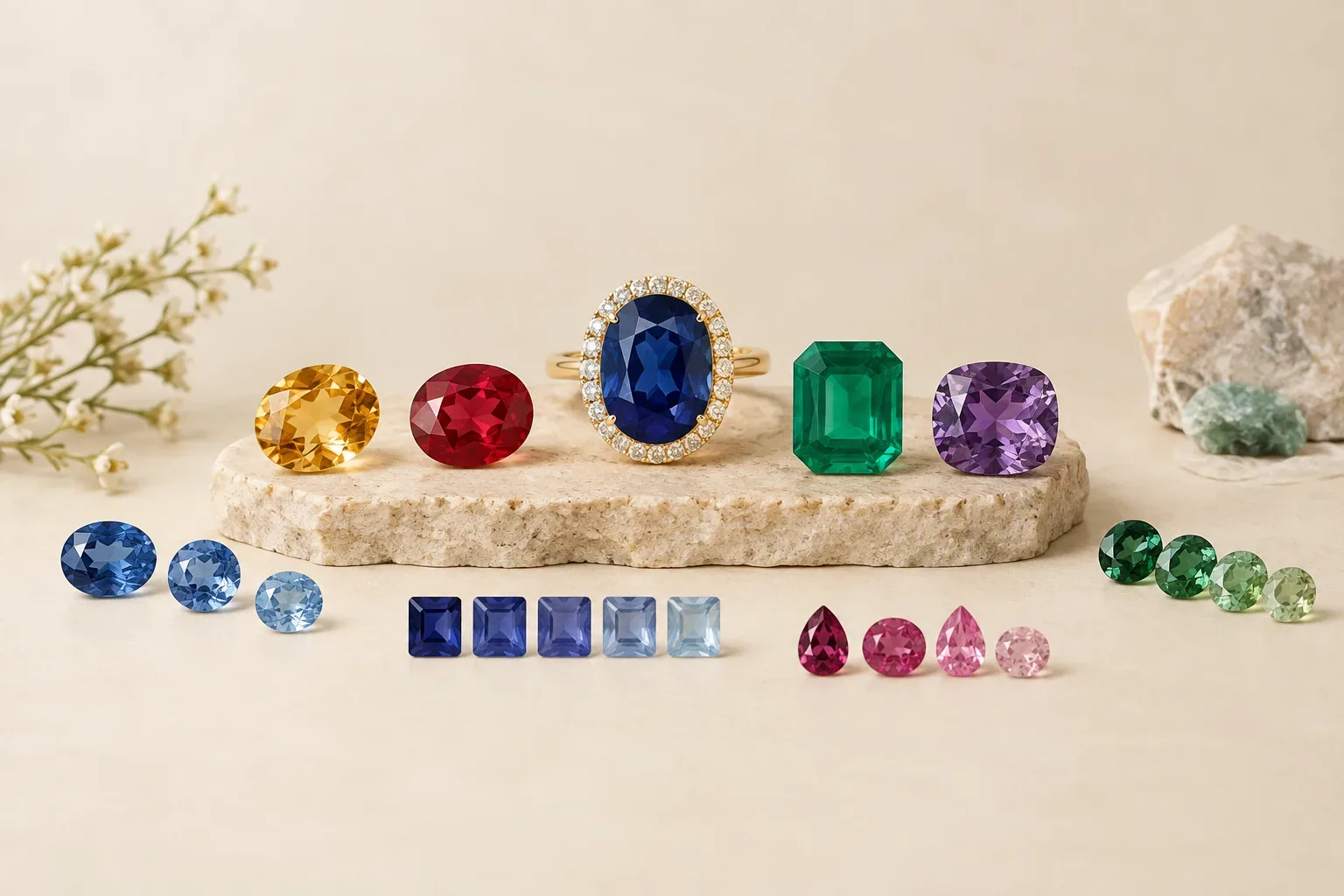
Meaning at a glance
Hue is the basic color family, tone is how light or dark that color appears, saturation is the color’s intensity, and uniformity describes how evenly that color is distributed; preferred ranges differ by species and market because chemistry, optical effects (pleochroism, color change, zoning), and consumer expectations interact to make some hues, tones, and saturations more desirable and valuable in specific gems.
Definitions: hue, tone, saturation, and uniformity
Hue is the name of the color family you perceive in a gemstone. A sapphire’s hue is commonly called blue, but sapphires occur in green, yellow, pink, and other hues. Hue answers the question “what color?”
Tone is the relative lightness or darkness of that hue as seen by the viewer. Tone ranges from very light to very dark and influences whether a stone reads as pastel, medium, deep, or near-black in appearance.
Saturation (or chroma) measures a color’s purity or intensity. High saturation means vivid, pure color with little grayness; low saturation means the color looks washed out or grayish.
Color uniformity refers to how evenly hue, tone, and saturation are distributed across the gem. Zoning, patchiness, or banding reduces uniformity; a uniformly colored stone presents the same color character when viewed from different positions or under different lights, ignoring phenomena like intentional color change.
Why different gems call for different color ranges
Mineral chemistry sets the physical limits of color for each species. The Gemological Institute of America (GIA) shows that atomic and structural causes of color differ from one gem to another and affect which hues and saturations are possible or stable in that material. For example, the way trace elements substitute into a crystal lattice determines whether a species can produce highly saturated colors without going too dark or too opaque.
Optical phenomena specific to some gems change how color is judged. The GIA explains that pleochroism (a gem showing different hues or intensities from different directions) and color zoning make uniform, highly saturated color difficult or impossible in some stones, so acceptable ranges shift accordingly. GIA’s coverage of alexandrite and color-change phenomena shows that in gems that change color under different light sources, the dynamic nature of color is part of the desired effect rather than a defect.
Market preferences reflect rarity and cultural taste. A deeply saturated ruby or Burmese ruby with a particular hue historically commands a premium because that combination is both rare in corundum and culturally prized. By contrast, for emeralds, some buyers accept slightly darker tone or minor inclusions because the typical beryl chemistry produces rich, deeply saturated green with internal characteristics that are common to the species. GIA’s value-factor guidance summarizes how color interacts with other factors such as clarity and cut to shape market value.
Historical evidence — what the professional literature documents
Documented gem trade and research literature focus on physical causes and market treatment of color rather than universal symbolic meanings. The Gemological Institute of America (GIA) has published technical guidance on how hue, tone, saturation, and uniformity affect value for colored gemstones, and it attributes market valuation to observable color qualities rather than fixed cultural symbolism.
GIA’s reporting on alexandrite illustrates how historical and scientific description intersect: alexandrite is historically recognized for a strong color change under different light sources, and professional descriptions emphasize the optical behavior (color change versus pleochroism) as a definitional characteristic that collectors value. GIA’s research into how lighting and viewing conditions change appearance also documents why the same gem can look quite different in daylight, incandescent light, or photographic studio light.
GIA’s materials and diamond research pages explain that atomic causes of color and detection of treatments are documented scientifically; that documentation underlies how the trade and labs grade and describe color. The Federal Trade Commission’s consumer guidance reinforces that treatment disclosure and honest representation are historical and legal responsibilities in modern commerce, and that consumers should be informed about enhancements, lab-grown material, and imitations.
Historical meanings versus modern personal interpretation
Historical or documented meanings in the gemological literature emphasize optical and chemical properties and how those properties have been used in trade and appraisal. Professional bodies like the GIA document which colors and optical effects are diagnostic or valuable for a species, and they avoid asserting universal symbolic meanings.
Modern personal interpretation—that a certain hue symbolizes love, healing, or luck—belongs to individual belief systems and contemporary marketing rather than to the scientific record. Those personal meanings can be meaningful and appropriate for gifting or personal jewelry, but they should be treated as subjective and culturally specific. In other words, the presence of a vivid red ruby may be described by gemologists as rare and valuable, while recipients or cultures may independently ascribe symbolic meaning.
How hue, tone, saturation, and uniformity appear in finished jewelry
Cut and setting shape how the wearer sees color. GIA guidance on factors that affect appearance notes that cut proportions, facet arrangement, and polish influence tone and saturation in transparent gems by controlling light return and absorption. A deeper pavilion or darker tone can make color appear more intense, while a shallow cut may make color look lighter and less saturated.
Settings and metal color affect perceived hue. Warm yellow gold tends to emphasize warm hues and can make a gem look slightly warmer, while white metals keep the perception cooler. Designers choose metal and setting styles to either contrast with or enhance a stone’s inherent hue and saturation.
Photographs and display conditions matter. GIA’s recommendations on gem photography demonstrate that lighting temperature, diffusion, and direction change how hue, tone, and saturation reproduce in images. This is why in-person viewing under consistent, natural or standardized light is a better test of color than a single online photograph.
Certain traditions in jewelry highlight particular color traits. For gems with pleochroism or color-change behavior, designers sometimes orient the stone so the most desirable face-up hue appears in the mounting, or they use cabochon cuts for phenomena like asterism or cat’s-eye to emphasize optical effects rather than pure saturation.
Practical and respectful selection or gifting guidance
Decide whether you are prioritizing species-appropriate ideal color or personal symbolism. If the recipient values market “best” examples, learn which hue, tone, and saturation ranges are desirable for the specific gem species—professional guides from the GIA describe how those factors influence value. If the choice is symbolic or personal, prioritize the hue and intensity that most appeal to the receiver.
View gems under multiple, consistent lighting conditions. Relying on a single photo or showroom light can be misleading; GIA’s guidance on lighting shows that color appearance shifts under different light sources. Ask to see stones in natural daylight and under a standardized light if possible before buying.
Consider uniformity and optical effects. For gems prone to color zoning or pleochroism, inspect the stone from several angles. For color-change gems, check the appearance in both daylight and incandescent light—the unique change is often the prized attribute, as GIA’s alexandrite guidance notes.
Ask for transparent information about treatments and origin. The Federal Trade Commission advises consumers to require disclosure about heat treatments, diffusion treatments, dyeing, impregnation, lab-grown origin, or simulants. For many buyers, knowing whether a gem is natural, treated, or lab-grown is as important as the color itself.
Match setting and metal to the stone and the recipient. Choose settings that show the best face-up color and metal colors that flatter the hue. When giving a gift tied to personal meaning, include a note that explains why you chose that particular hue or gem—acknowledging personal symbolism is respectful and adds emotional value.
Final thoughts
Hue, tone, saturation, and uniformity are distinct but related attributes that together determine how a gem looks and how it will be valued by specialists. Professional sources like the GIA frame these qualities in terms of chemistry, optics, and market practice, while consumer advice from the FTC emphasizes honest disclosure.
Understanding the material-specific limits and desirable ranges for each gem species will help you make informed buying or gifting decisions. When in doubt, examine stones in person, ask clear questions about treatments and origin, and choose what best suits the wearer’s taste and the gem’s natural character.
Frequently asked questions
How do I tell if a gemstone’s color is accurately represented in a photo?
Photos are influenced by lighting, camera white balance, and post-processing. Follow the Gemological Institute of America's advice to view stones under multiple lights, request images shot under standardized lighting, and, when possible, inspect the gem in person to judge true hue, tone, and saturation.
What is color-change in gems and how should that affect my choice?
Color-change describes a gem that appears different under different light sources; GIA’s alexandrite guidance shows this is a valued optical property. If you prize color-change, examine the stone in daylight and incandescent light to confirm the effect and factor that dynamic behavior into your selection.
Why do some gems look patchy or zoned in color?
Color zoning arises from growth conditions and the way trace elements were incorporated during formation; the GIA documents that zoning affects uniformity and can influence cut orientation, value, and where designers choose to place the gem in jewelry.
Should I be concerned about treatments that affect color?
Yes. The Federal Trade Commission advises buyers to seek disclosure of heat treatments, diffusion, dyeing, impregnation, and whether a stone is lab-grown or a simulant. Treatments can alter tone and saturation and frequently affect price and care requirements.
How do pleochroic gems affect how color is assessed?
Pleochroism means a gem shows different colors or intensities when viewed from different directions. As the GIA explains, pleochroic gems require examination from multiple angles and sometimes specific cutting orientations to present the most desirable face-up color.
Is a more saturated color always better?
Not always. The ideal saturation depends on the gem species. For some species, extremely high saturation can make the stone appear too dark or opaque, while in others high saturation is the most desirable trait. Professional guidance for each species helps define the preferred range.
Sources and further reading
- Colored Gemstone Value Factors — Gemological Institute of America
- Factors in Colored Stones that Interact to Affect Value — Gemological Institute of America
- How to Photograph Gems and Jewelry — Gemological Institute of America
- Alexandrite Description — Gemological Institute of America
- GIA Diamond Research — Gemological Institute of America
- Buying Gemstones, Diamonds, and Pearls — Federal Trade Commission